Etched Glass and Eating Your Own Dog Food
October 17, 2017
Why The Little Details Matter
by Jacob Drucker
The etched glass panes at MATTER drive me crazy.
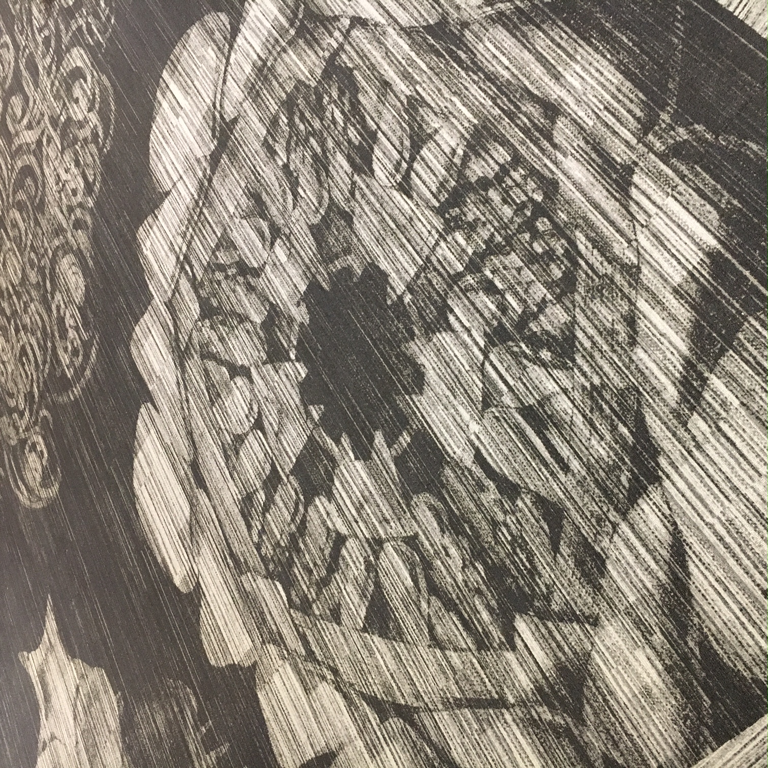
MATTER is the health-tech workspace in Chicago’s Merchandise Mart that houses Supply Clinic and dozens of other young healthcare companies. When they set up their space 2+ years ago, the MATTER staff did a remarkable job of making the space seem modern and relevant. The carpet design is based on the drawings of a 19th century biologist, and the glass panes that make up conference room walls are etched with molecular biology designs.
But there’s just one problem with the etched glass panes- they’re etched on the side of the pane inside the conference rooms. So if someone wants to draw on a pane of glass with a whiteboard marker, they can only do so from outside the conference rooms. And the only conceivable time that you’d run out of whiteboard space and want to keep going onto glass is when you’re, well, in a meeting. I’ve even seen companies pull wheeled whiteboards into conference rooms, because they can’t use the glass walls as boards.

The glass panes, for me, serve as a constant reminder that small details can have such a strong impact on user experience. Just like the soundproofing imperfections in phone booths, the panes could have used just a little more attention during installation.
Supply Clinic has customers, too. And our customers each interact with a number of pages on our website on their path from signing in to purchasing products. Each page is a chance to impress, as well as a potential place to lose a customer. When checkout flow isn’t exactly what a customer expects, or a signup form is ordered in a counterintuitive way, some potential customers won’t make it through. And if they do, they still won’t have the user experience we strive to provide.
MATTER, to their credit, has corrected many of the small user interface peccadilloes. The phone booths, for instance, used to echo, and were generally not conducive to phone calls. They all now have covered corkboards, helping to absorb stray sounds. And it’s just as important that we continue to improve our website, listening to our customers and making their user experience even better than it already is.
Of course, we can’t rely exclusively on customer feedback. If someone browsing the website gets turned off by a certain page, they might not bother to tell us (or make a purchase). So instead, we use our website. All the time. Need toothbrushes? Supply Clinic. Cotton-tipped applicators? Supply Clinic. Gag gifts? Supply Clinic. And we hope that we catch any issues before customers do.
Using your own product is often called eating your own dog food, presumably stemming from an old dog food pitchman who fed his dog food to his own dog. (At least I hope that’s where the term comes from.) And we’re lucky- we can tweak our dog food every week, constantly making it better. It’s far harder to flip dozens of panes of glass.
Ready to save with Supply Clinic?
Start Shopping!